A thank you page is the first thing that shows up after a conversion happens on your website – a customer followed a CTA on a landing page, downloaded your ebook, or signed up for your newsletter. For many marketers, a thank you page is merely a way to express their gratitude to the user for taking the desired action. But if you look at it that way, you’d be missing out on some great opportunities to increase revenue, nurture leads and retain customers.
A thank you page could be much more than an acknowledgment. It has huge potential. As HubSpot put it, “Think of a Thank You page as both the last step in your conversion process and the first step for customer retention.”
In this article, we’ll break down the essential elements of a thank you page, and explore different ways to use your thank you page to scale up your conversion rate, including some brilliant examples.
The Benefits Of A Thank You Page
A Thank You page has a similar function to a confirmation email, except it isn’t up to the viewer to open it. It is a very natural opportunity to give the customer something of value, that will pleasantly surprise them and take them even further along your sales funnel. If you managed to turn a visitor into a lead, with some more gentle guidance, they could become a full-fledged customer and even a brand ambassador.
For example, if a customer purchased dog food on your website, use the thank you page to provide them with additional content and resources on dog care. Alternatively, use this real estate to let the customer know what the next steps are (We’ll see examples of these ideas in action further on).

3 Essential Elements of a Thank You Page
Every thank you page must have three essential elements before anything else is added. Those key ingredients are:
1. A confirmation message
Letting the user know their action was successful is the primary function of your thank you page, after all. To avoid leaving anyone confused, be as clear as possible. A simple “Thank you for subscribing!” or “Your free guide is waiting for you in your inbox” will do.
Let your customers and leads know what you will and what you won’t do with their information. Build trust by reassuring them that you’re only interested in delivering value and won’t be spamming their inbox just for the sake of it.
2. Instructions on what to do next
The second must-have component of any thank you page is specific instructions on what to do next. For example, if your new subscriber needs to confirm their email address, you might say something like “Go to your inbox, open the email from Our Company, and click the confirmation link. If you don’t see a confirmation email, check out your spam/junk folder”.
Specify any guidelines a user must follow, such as presenting an ID proof to collect tickets at the theater counter, and so on. The instructions don’t need to be lengthy, but they need to be precise.
3. A clear call-to-action
Now that you’ve confirmed the user’s action was successful and explained what they should do next it’s time to gently nudge your new lead or customer towards their next step in the sales funnel. Interestingly, this is where many thank you pages fall short.
Here are a few examples od calls to action you could include:
- Ask users to sign up for a webinar or event.
- Offer to coupon code and encourage users to start shopping.
- Ask users to share on social media.
Let’s dive a little deeper.
Other Smart Ways to Leverage Your Thank You Page
1. Encourage Referrals
When utilized properly, referrals can be a great source of revenue. Asking visitors to share the offer with their friends and family may seem too straightforward, but visitors won’t take an action if you don’t request it and make it simple to complete.
A new lead has already made it clear that they consider your offer to be valuable, so there is a good chance they would be willing to email or post the offer on social media, via a CTA button on the thank you page. It’s important to make sure they can do so immediately and with no friction, while the offer is still fresh in their minds.
2. Offer related products or services
Although some marketers would argue that the checkout page is the best place for cross-selling products and services, we believe that the post-sale thank you page is just as effective if not more so. You’ll want to customize these recommendations with an aligning offer, such as a complementary product or a coupon that is only valid for the next 48 hours.
As we already mentioned, the same can be done with relevant content. If your new lead downloaded an ebook on email marketing, use the thank you leads to provide them with links to other blog posts, videos, and infographics you have on the same topic. The best thank you pages work to get users excited about other offers or pages on the site, rather than letting them click away.
3. Flaunt that social proof
Some customers need more convincing than others to refer your brand to others or to go from downloading a whitepaper to requesting a free trial. In such cases, customer testimonials, reviews, and number dropping might do the trick.
Remember, a small conversion could lead to bigger things down the road. Use your thank you page to build trust in your potential clients.
4. Ask for Feedback
Let’s admit it, a happy customer is less likely to hit the ‘tell us what you think’ button, than a frustrated one. Collecting a customer’s genuine feedback is one of the best ways to figure out what you need to work on to improve your conversion rate in the future.
5. Provide an opt-in for your email newsletter
As we already said, people won’t take action if you don’t put the possibility in front of them. If users are taking you up on your offer, then they see you as trustworthy, or at least, interesting. Some of them would even like to hear more from you. Providing an easy opt-in form for your newsletter on your thank you page could do wonders for your mailing list.
And if you have a high-quality newsletter in place, turning hesitant leads into paying customers becomes even more likely. Don’t forget to mention why your newsletter is great, and what kind of valuable content they will find there.

6. Encourage them to create an account
This tip applies mostly to e-commerce thank you pages. Getting customers to create accounts is highly beneficial for any e-commerce business. But forcing people to do so when they’re trying to complete a purchase can cause 30% of users to abandon their cart.
Encouraging them to create an account after the sale tends to have higher success rates, especially if you offer incentives such as easy order tracking or future promo codes.
Examples for Great Thank You Pages
1. HubSpot

- HubSpot confirm the specific offer that the user was after.
- They encourage the customer to create an account in exchange of extra value – a certification course that is related to the guide they downloaded.
- They use their thank you pages to encourage visitors to get started with HubSpot for free.
2. Impact
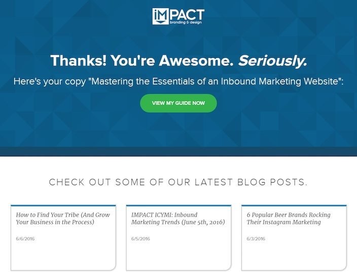
- Impact’s thank you page copy is personable and enthusiastic, which makes a customer feel excited and wanted.
- They, too, encourage users to engage with content related to their offer.
3. FITmeals
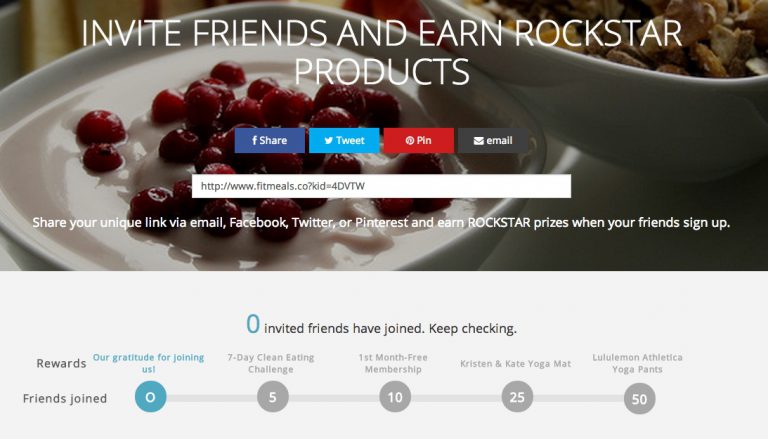
- FITmeals, a company that provides personalized healthy meal kits straight to the customer’s doorstep, uses its thank you page to promote its loyalty program.
- They make it super easy to refer others through email and social media (great for spreading brand awareness).
- They incentivize customers to participate by offering different prizes depending on how many of their referrals join FITmeal.
4. WordStream
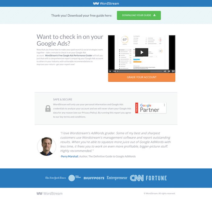
- Beyond giving immediate access to the resource the user downloaded, WordStream provides a helpful video encouraging users to try their Google Ad performance grader.
- They make great use of a related customer testimonial, as well as further social proof below.
5. Amazon
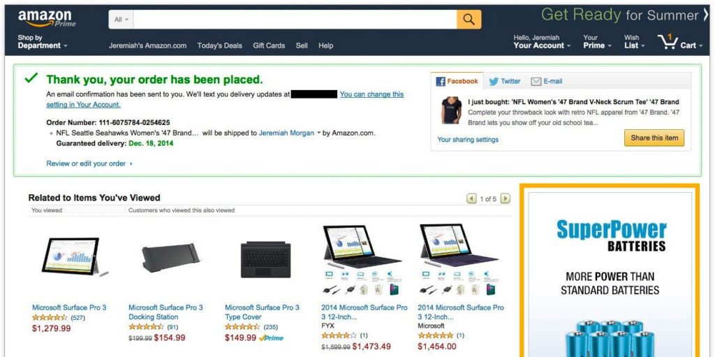
Amazon is essentially the blueprint of the upsell thank you page. Few companies have the capacity to collect, store, and leverage customer data on the level that Amazon does. This amount of information and the company’s essentially endless supply of items makes their order confirmation page incredibly effective.
6. Apple Store

- This Apple Store thank you page acts mainly as an order confirmation.
- It states all the relevant information regarding the order.
- It specifies what the customer should expect next, and gives clear instructions – “you will receive an email shortly”, “visit order status to make changes…”
- There is a visible “Tell Us What You Think” box at the bottom, encouraging feedback from customers.
7. Unbounce

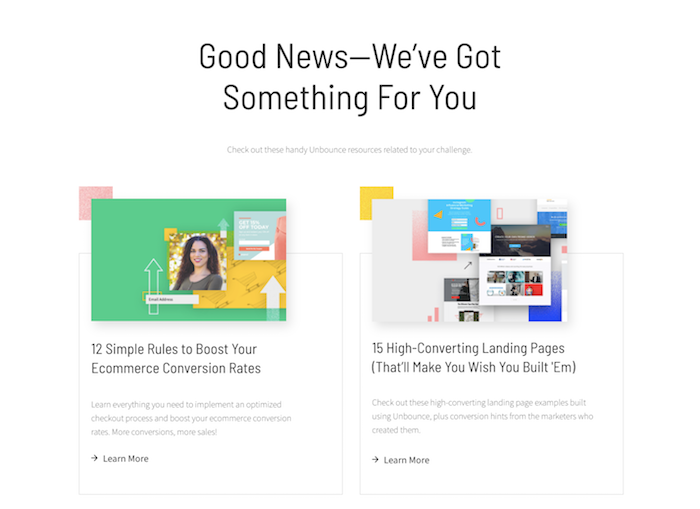
- Unbounce makes brilliant use of a survey on this thank you page. Below the CTA to download the offer, they placed a super quick one-question survey asking “What’s Your Biggest Challenge?”
- After choosing your challenge, a collection of resources load on the page, specifically targeting your problem.
- Note how Unbounce encouraged the user to continue exploring their content in a way that feels personalized and relevant to that individual.
Final Thoughts
There are many ways you could go with your thank you page depending on your business goals, the important things is to not neglect it. It’s valuable real estate that you can use to further engage your leads, promote brand loyalty, and build stronger relationships with your customers.
As you see, there are many ways to boost conversions through your thank you page, but it’s just as important to be selective. Don’t overwhelm your leads with requests to refer a friend, sign up for a webinar, and complete a survey. Instead, focus on one best practice, test it, and find what is most beneficial for your business.


