What makes a SaaS landing page compelling? What’s the secret to conversions? There is no better way to answer these questions than by taking a look at some of the best-performing SaaS landing page examples.
Having a great offer is key, but presentation and experience are just as important. Each and every element of a SaaS landing page, from design to copy to functionality, should be consistent and representative of your brand. A SaaS killer landing page can make all the difference between an industry average ROI and a conversion rate that leads to meaningful growth.
So if you’re looking for inspiration or want to size up the competition, we’ve put together a list of 14 high-converting SaaS landing page examples you can check out.
What’s a SaaS landing page?
A SaaS landing page, just like any other type of landing page, is a dedicated page built for a specific campaign. Each SaaS landing page has one goal – to convert as many visitors as possible by providing a hyper-relevant offer.
With a landing page, you can tailor your message and offer to different segments of your audience. You could also make sure the messaging fits the source of traffic they landed from – whether it’s Google, LinkedIn, email marketing, etc.
For example, you want to increase the number of free trials for your SaaS product. So instead of sending the traffic from your Google ad to your homepage, you send them to a dedicated landing page that highlights the exact features and benefits they were searching for.
The Anatomy of a SaaS Landing Page
Every successful SaaS landing page is made up of a few core elements:
- Hero section: The top of the page that is found above the fold. Because it’s the first thing a visitor sees it needs to be both compelling and include all the information needed to take action immediately. Must include an attention-grabbing headline and sub-headline and an enticing call to action.
- Social proof: Customer reviews, testimonials, client logos, awards, etc.
- Features: What features does your [rofuct include and what paint points do these features address?
- CTA buttons: buttons encouraging visitors to take action. You must be clear about which action you want them to take – start free trial/sign up/request demo etc. Do not try to achieve more than one goal on a single landing page. Including more than one offer could decrease conversion rates by 266%!
- Contact form: A form or single field where visitors can leave their contact details for future communication.
- Product video: Give your visitors a chance to see how your product operates and what they can expect.
- LiveChat/Chatbot: Provides a way for you to respond immediately to customer questions or concerns.
14 Best SaaS Landing Page Examples
1. AirTable
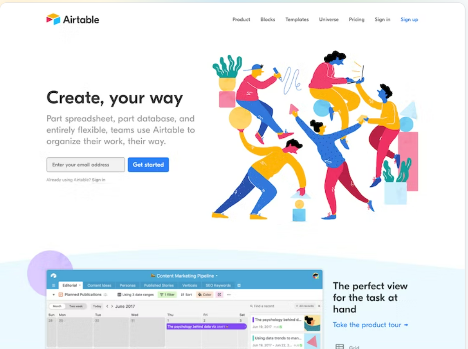
Airtable is a platform that allows companies to build custom applications that fit their needs, without needing to code. These custom tools help companies streamline different workflows and projects. AirTable’s proposition might be difficult to understand at first, but the landing page excels at explaining the product’s value and features.
Highlights:
- Animated product demo: To really make the product come alive, Airtable uses an animated product demo on its landing page. This is a great way to convey your product’s interface and capabilities to new visitors.
- Social proof: Airtable is used by many popular brands like Netflix and Shopify. The landing page builds trust in new visitors by showcasing these logos early on.
Extra points for:
- A short and informative hero title accompanied by clear and concise explanations of what the software offers.
2. Monday.com
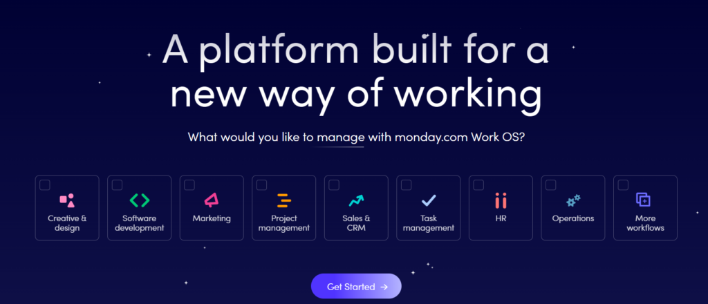
Monday.com is a task management platform that makes it easy for teams to manage projects collaboratively.
Highlights:
- Clever design: The product’s capabilities are presented like tasks you can check. This creative design corresponds perfectly with the product’s UVP. Additionally, the integration options are shown through sliding platform logos. The overall design is neat and simplified to eliminate distractions.
Extra points for:
Highlighted customer support: Monday’s landing page makes it clear that users can reach out to their support teams 24/7 through different channels.
3. ActiveCollab
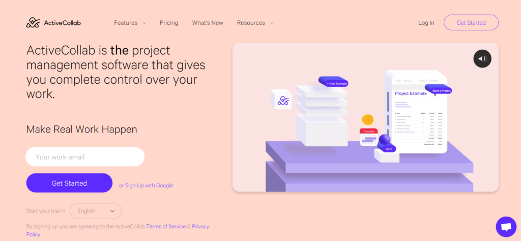
ActiveCollab is a project management and collaboration tool that combines task management, time tracking, and billing into one app.
Highlights:
- CTA button contrast: The blue ‘Get Started’ stands out in contrast to the peach-colored background. It has been proven that color palettes in marketing have a significant impact on conversions. Even though it’s not as simple as “switch up your colors and your business will boom”, choosing the right color palette for your landing page is a very important part of the design process.
- Language selection: ActiveCollab’s landing page has a language option when starting the trial. It’s located right under the CTA button and it’s an excellent way to emphasize one of the product’s main advantages – its multi-language options.
Extra points for:
Social proof: this landing page doesn’t only showcase the logos of the client companies but also states the (impressive) number of teams that have used the software so far.
4. Asana
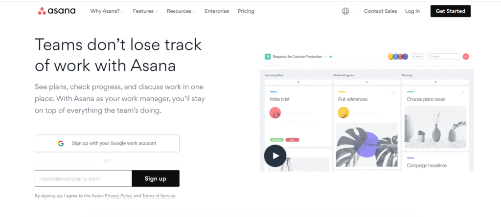
Next on the list is Asana, yet another collaborative project management software.
Highlights:
- Compelling video: one of the first things to grab a user’s attention when landing on the page is the headline and a video that opens as a lightbox popup. Both of these elements are well thought out and super compelling, and their combination creates a convincing explanation of the product’s value.
- Case studies: further down the page, you can find an interactive panel of case studies. Choosing this presentation style is clever because it allows viewers to see there are many success stories of existing Asana customers, even if they don’t click on anything.
Extra points for:
Animated GIFs: Asana showcases the software’s interface and features through GIFs, making it easier for users to imagine themselves actually using it.
5. Sprout Social
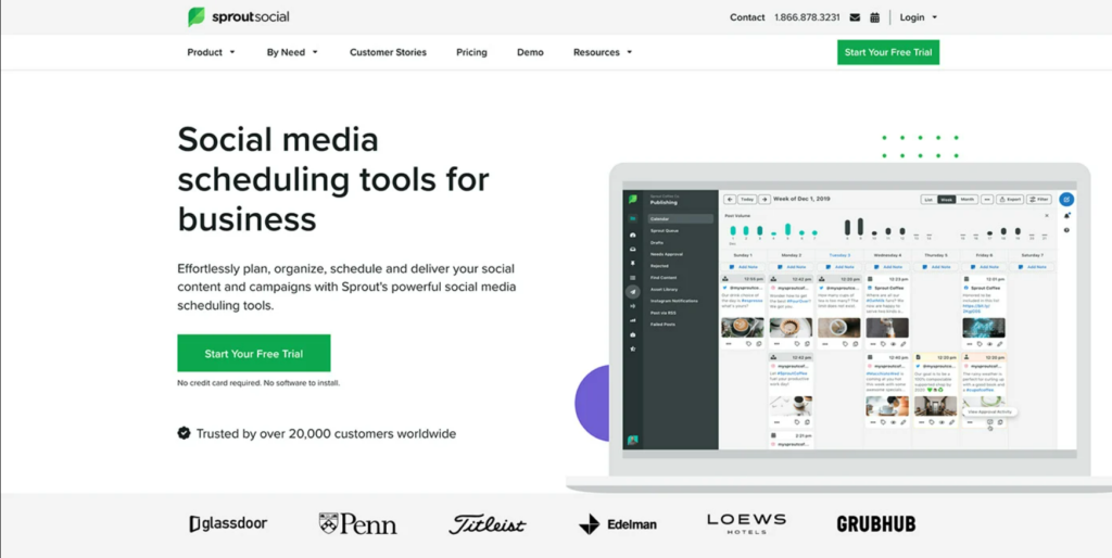
Sprout Social is a social media management tool that offers analytics, social management, and customer care on one platform.
Highlights:
- Focused messaging: SproutSocial’s landing page isn’t too long. It’s focused and effective with consistent messaging and a single CTA (“start your free trial”).
- Strong social proof: Just above the client company logos, SprouSocial points out the number of clients currently using their software.
Extra points for:
Live chat: According to HubSpot, conversational experiences on landing pages, such as live chat and chatbots, tend to convert three-to-four times more than traditional landing pages.
6. KickBox
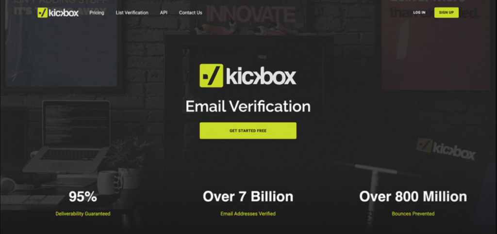
KickBox is a software that helps businesses implement email marketing best practices, including secure email verification and a full suite of deliverability monitoring and management tools.
Highlights:
- Benefits demonstrated by numbers: Underneath the CTA users can clearly see the benefits of using KickBox through statistics like “over 800 bounces prevented’. This is a clever way to make the platform’s success rates more tangible and convince users of its efficacy.
- Minimal design: The design on this landing page is minimal yet sleek and effective. It allows viewers to focus on the message without distraction. There is also a single CTA that repeats itself throughout the page.
Extra points for:
Live chat
7. Shopify
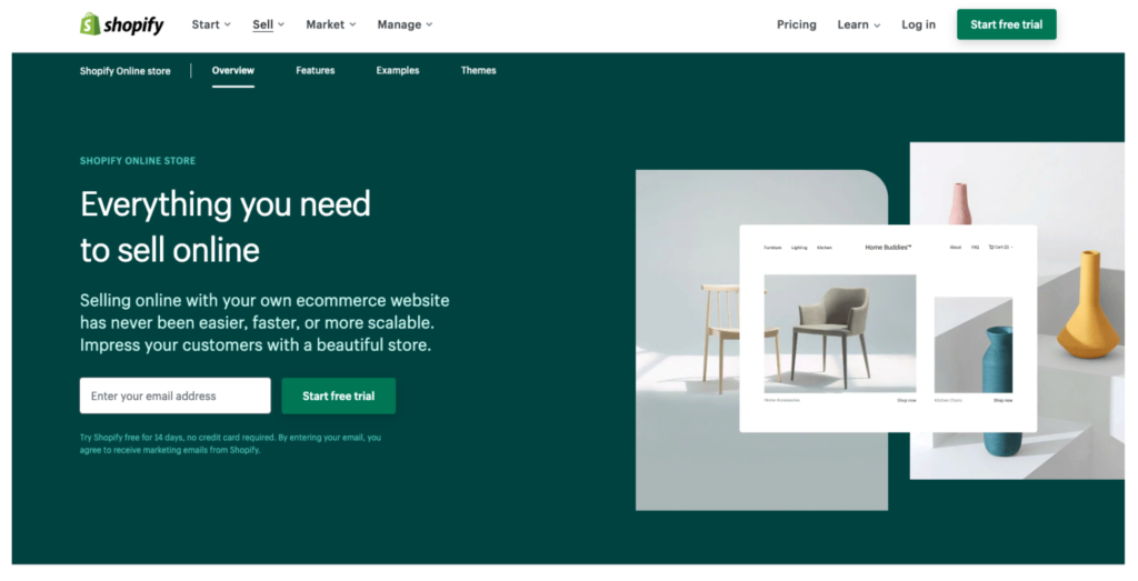
Shopify is an eCommerce platform that lets users build, manage and grow online businesses.
- Low word count: A recent report from Unbounce discovered that readability and word count have a significant impact on landing page performance. The highest converting landing pages were those that kept the copy short and easy to understand.
Shopify excels at that – on this landing page, they present their offer in approximately 500 words, in simple, accessible language. - FAQs: Shopify uses some of the precious real estate on its landing page to answer frequently asked questions, which doesn’t only provide value for users but also highlights the benefits of the product in a non-salesy way.
Extra points for:
Distraction-free: The overall design, like the copy, is clean and cohesive. It only highlights a few key elements. Even the color palette and the images are simplified to reduce distraction.
8. Zoom
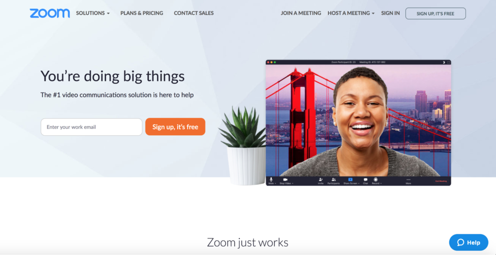
Zoom is a cloud-based video conferencing service, that allows organizations to hold remote meetings and connect with each other from anywhere in the world.
Highlights:
- CTAs: Yes, we know we said a single CTA is the way to go. But this one is a rare exception. Zoom’s landing page goes back and forth between showcasing the strengths of its offer and CTAs and form fields. While the sign-up form is simple and only contains one field, requesting a demo takes the user to a longer form. Leads who land on this secondary form have likely already signed up, which makes this longer form less overwhelming to them.
- Pain points: A lot of the copy on this landing page addresses real user pain points, which most users of video conferencing software are awfully familiar with.
9. WeTransfer
WeTransfer is an online file transfer service. It allows users to share large files and photos.
Highlights:
- No scroll-down: This landing page is a single page meaning there is no scroll-down – all the information is in front of you, which makes it clearly focused.
- Single focus CTA: Another element that makes this landing page very to-the-point is the single CTA “Go Pro”.
Extra Points for:
Directly usable: Any visitor who lands on this page can directly use the service for free and without signing up. This model is not suitable for all businesses of course, but it’s a clever move from WeTransfer because it demonstrates how well their product works, so more users are easily convinced to go Pro for more GBs.
10. Slack
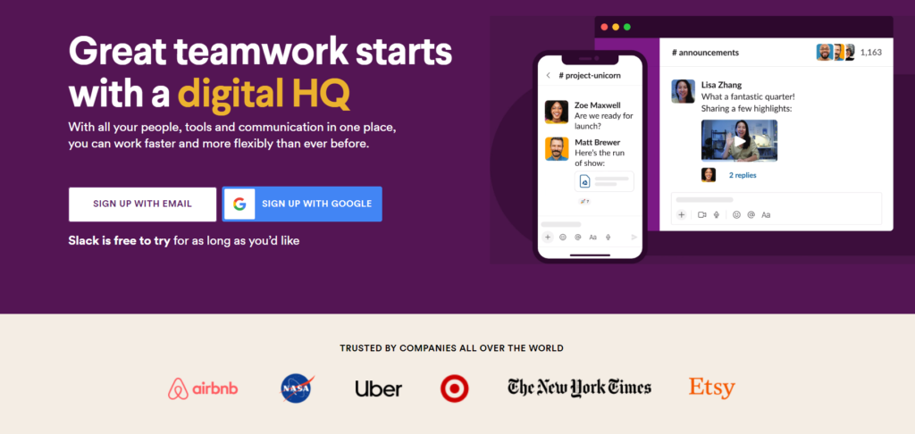
Slack is a messaging app designed specifically for businesses. It allows teams to communicate easily and streamline their work processes.
Highlights:
- Visuals: Many brands incorporate GIFs on their landing pages but perhaps none as successfully as Slack. Instead of saying “good communication drives great teamwork” Slack uses playful imagery and GIFs to show it. The use of visuals can convey emotions and engage viewers in ways words alone cannot.
Extra points for:
Option to sign up with Google: the main CTA to sign up for slack has two options: to sign up manually or with Google, making this step simpler and eliminating friction.
11. Figma
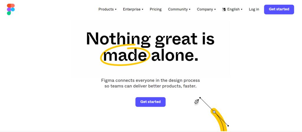
Figma is a design platform where teams can create websites, application logos, and more. It lets designers and developers share and streamline their work.
Highlights:
- Changing hero headline: the hero headline of Figma’s landing page is used as part of the animation, which helps draw attention to it and demonstrates the creative abilities of the product straight away.
- Community: one of the features that set Figma apart is the Figma community – a space where users can publish live design files, inspect others’ work and learn from each other. It is showcased at the bottom of the page with examples from ‘buzzworthy’ companies such as Spotify.
Extra points for:
Animated feature explanation: Each feature explanation is accompanied by an animation showing how it works.
12. MailChimp
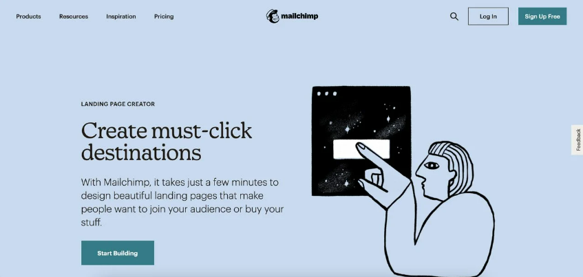
MailChimp is an email marketing platform that helps businesses and marketers manage and communicate with clients, customers, and leads.
Highlights:
- Top features: the features that make this platform valuable are showcased simply and aesthetically, each one accompanied by a CTA encouraging viewers to try it out for themselves.
- Links to resources: At the bottom of the landing page there are links to several helpful resources on digital marketing, which sets the company as an authority in its field and instills trust in visitors.
Extra points for:
White Space: White space is blank space left between the elements on a page. It doesn’t necessarily have to be white, but it’s intentionally left blank. It creates a sophisticated image and maximizes the focus on the page’s elements like the CTA and images. MailChimp’s landing page makes great use of white space.
13. Typeform
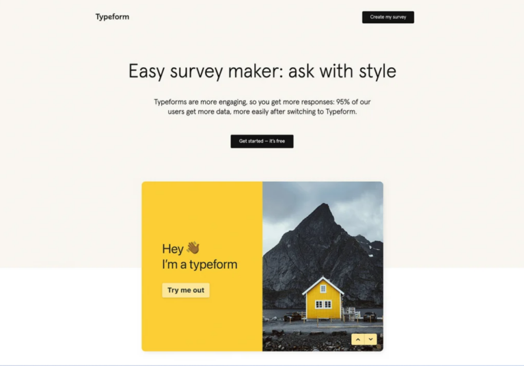
Typeform is a tool that helps companies engage their audience with quizzes, surveys, and forms without having to code.
Highlights:
- Live demo embedded within the page: at the bottom of the page there is a CTA reading “Create my Survey”. By clicking it users can experiment with a live demo of the product.
- Frictionless: There is no navigation bar or footer on the landing page, which eliminates any friction or distractions. This allows viewers to only focus on the content and offer presented on the page.
Extra points for:
Minimal design, white space
14. Namogoo
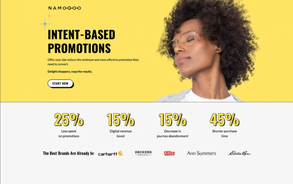
Namogoo is a SaaS platform that helps businesses grow by tracking and improving customer journeys, adapting autonomously to each customer visit in real time.
Highlights:
- Copywriting: the value proposition (“Offer your visitors the minimum and most effective promotion they need to convert”) is worded in a unique and attention-grabbing way without being vague or it hard to understand.
- Hero shot: The choice of image compliments the hero title and draws the viewers’ attention to it.
Extra points for:
Single CTA (Start Now) and social proof.
Final Thoughts
As you can see, while it’s difficult to produce a landing page that is all-around perfect, there are plenty that come close, or that choose to highlight just the right element for their audiences. It may take some trial and error, and a lot of testing. And if you could use a consultation, we’re always here.