So you’ve ramped up your social media strategy, and Google ad campaign. Your landing page is getting decent traffic, yet you aren’t getting as many conversions as you’d hoped. This could be because something about your landing page is just… off. The mistake could lie in the overall landing page design, or in something seemingly small like the CTA wording.
A landing page is one the most effective lead generation tools out there, so getting it just right is crucial.
In this article, we’ve gathered some of the most common landing page mistakes companies make. Is one of these at fault for mercilessly killing your conversions?
1. Not thinking in ‘mobile-first’ terms
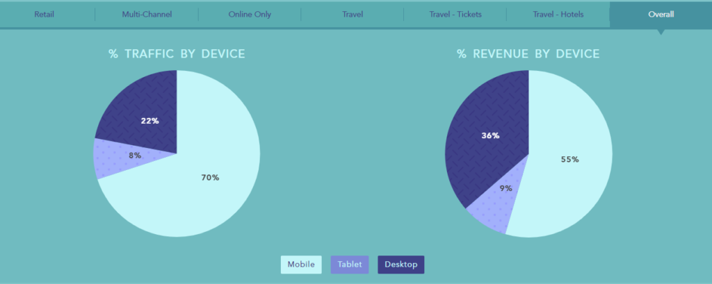
By now, most businesses understand the importance of having mobile-friendly landing pages. But to truly optimize your landing page for mobile, even having a responsive design may not be enough. Despite mobile use being on a consistent rise in the past few years, research shows that the conversion rates of mobile users are not as high as they could be when compared to the overall traffic of mobile users.
But why is this happening? Think about it, the very nature of mobile use is distinctly different from desktop. It’s not only the smaller screen you need to keep in mind – a mobile user may be trying to sign up for your free trial while they’re waiting for the bus or walking around the grocery store. Oh wait, a call just came in. You get the point, mobile users are far more susceptible to friction, which can often result in lower conversion rates.
What mobile-first actually means is having a dedicated, mobile-only experience. Designing your landing page with desktop users in mind and using responsive design to make it look good on mobile doesn’t necessarily address the specific needs of mobile users.
Take a look at Mouseflow’s landing page for example:
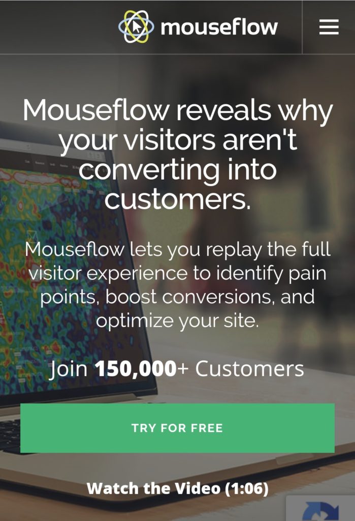
All the key information fits on a single screen while keeping the design looking clean. The CTA is in a contrasting color so it stands out and is easy to click on. Lastly, there is a video for those who want more information, but most users can get the gist upfront, so the page works well.
2. Having just one generic landing page
According to a HubSpot research, companies with 31-40 landing pages get seven times more leads than those with only 1-5 landing pages. In fact, studies going as far back as 2011 reached the same conclusion – the more landing pages a business has, the higher the chances of actually generating leads.
The reason behind it is simple – a customer is more likely to be receptive to an offer that is tailored to their own specific needs. Does that mean you must create 40+ landing pages for each campaign? Not necessarily, but providing a variety of different offers on your website will prove extremely valuable to your business.
Your offer can differ depending on two factors: the sales funnel stage or the customer persona.
- Funnel Stage – not everyone visiting your website will be on the same stage of the sales funnel. A first time visitor will be less likely to request an in-person consultation, but might be happy to download your carefully crafted template kit. A returning customer, on the other hand, who has already downloaded your content offers (templates, ebooks, webinars etc.) may be ready to book that consultation.
- Customer persona – You might have a pretty good idea of who your target audience is, but every group can be divided into different segments. For example, if you’re trying to generate sign-ups for your SaaS product, you can create role-specific landing pages to target marketing managers, sales teams, etc.
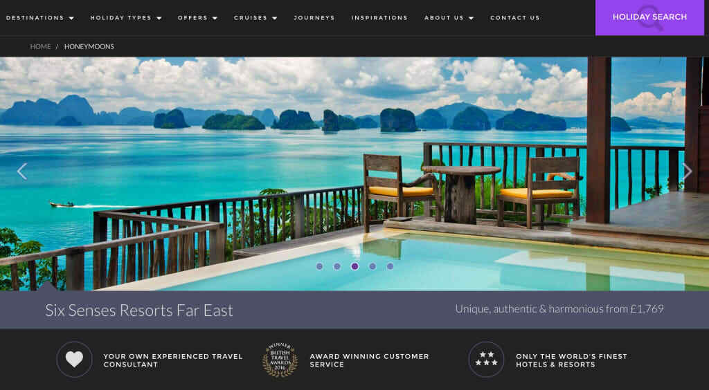
UK-based travel website Destinology, for example, takes honeymooners to this specific landing page.
An added bonus of having multiple dedicated landing pages with different offers is that you’ll provide Google with more pages to index, and give your website an SEO boost.
3. An intimidating lead generation form
Ultimately, the end goal of every landing page is to obtain the customer’s contact information so you can start nurturing them as a lead. Think of it as a transaction, where both you and your customer gain something.
The way you craft your opt-in form is detrimental to whether the visitor will complete it or bounce. Don’t make the mistake of asking for too much too soon and come off as intrusive.
To create an opt-in experience that isn’t threatening you have 2 options:
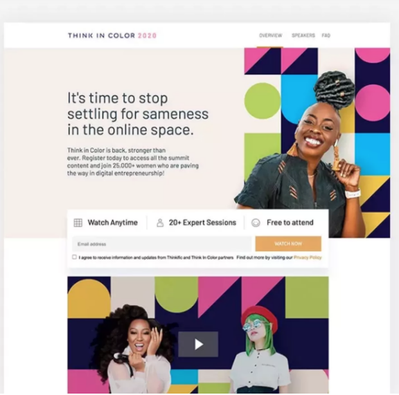
- Use as few fields as possible – If it isn’t absolutely necessary, it can wait for later. For example, in this event landing page, Thinkfic is asking for only one thing: the visitor’s email.
- Use the breadcrumb technique – Sometimes you have a better chance of getting your customer to complete the form by requesting the contact info at the last step of a multi page form.Wait, what? Increasing the length of the form to multiple pages? It may sound counterintuitive, but hear us out.
Multi-step forms are a relatively new trend that’s generating some incredible conversion rates – especially those designed so they don’t actually look like forms at all. Not only do they put the user at ease, but the process of answering multiple questions makes the form feel more personable and the user feel more invested.
Start off by asking for non-threatening information first, like basic details about their business. The next page fields will have a mediocre level of threat, and only the final page will contain the most intimidating fields – name, email, and phone number.
Multi-step landing pages work well for lead gen because they warm up the audience before popping the big questions. That’s exactly what you need for landing that first micro-conversion which allows you to start a conversation with your prospects.
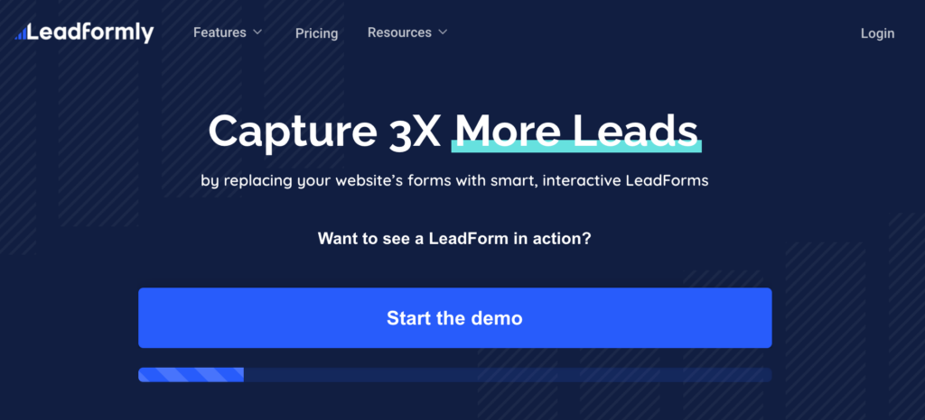
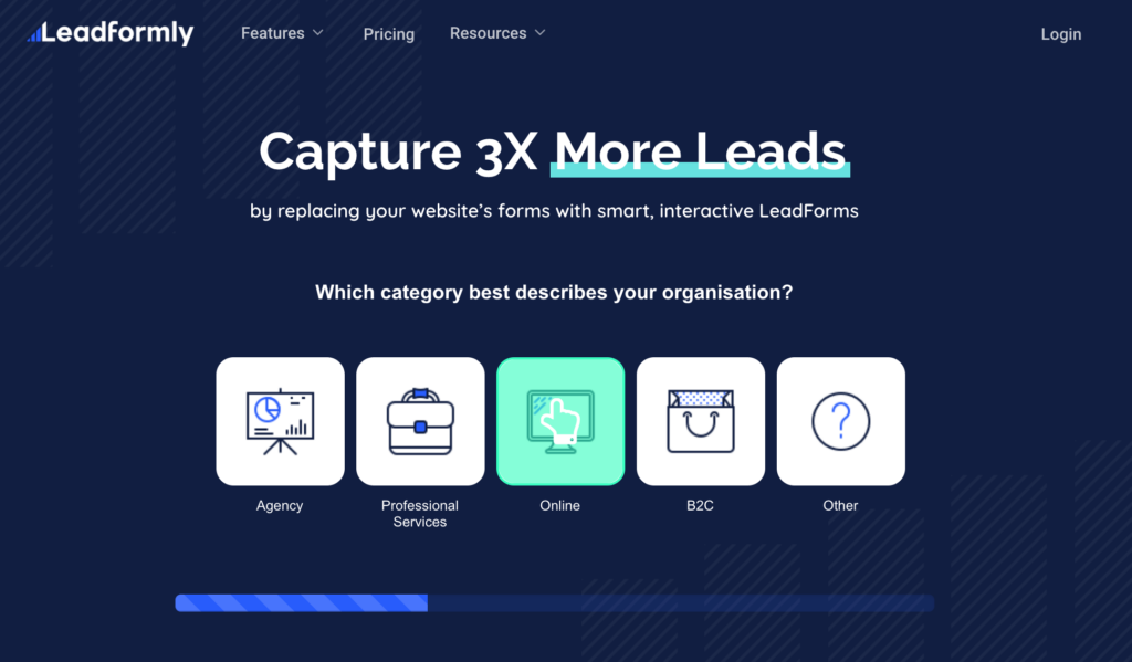
In this example from Leadformly, the users submit their information by clicking buttons or choosing from a preset list, which “gamifies” the process. By the time the users are asked for their personal details, they are already halfway through the form – in other words, they are invested.
4. The landing page doesn’t fit the traffic source
As we mentioned in mistake #2, your landing pages should be tailored to different potential visitors. Another thing to keep in mind, especially if you want to get that first micro-conversion that gets the ball rolling is to make sure the CTA matches the traffic source.
What do we mean by that? If the visitor came from a cold display ad, for example, don’t ask them to book a free consultation. That is a high-threat CTA that probably doesn’t align with the visitor’s intent.
PPC channels like Google Ads and Facebook Ads can be an indispensable resource to grow your business, but it’s important to utilize them properly by changing your CTA to match where the visitor is coming from.
5. A cluttered design
A good landing page design is clean, well organized, and clutter-free. A few tips to avoid clutter on your landing page:
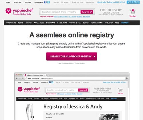
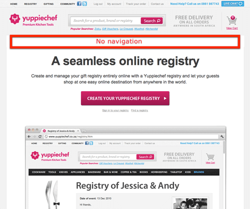
- Take out all distractions – links, unnecessary images, navigation bars, social share buttons and footers. Yuppicheif, an online store selling premium kitchen tools throughout South Africa, increased their signups by 100% just by removing the navigation bar from their landing page.
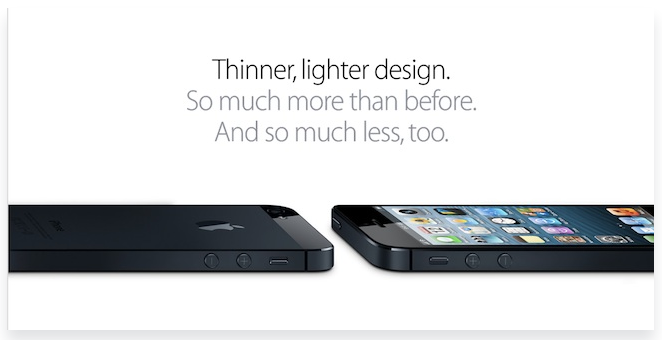
- Opt for White Space design – white space is the area between the different elements of the web page. With nothing else to look at, white space design makes people focus on what is important. It’s important to note that white space isn’t necessarily white. It can be any color (or even a background image), as long as it separates and contrasts the different elements.
Apple’s iPhone landing page is a good example:
- Implement the Don’t Make Me Think rule – a good landing is needle focused on one single action, making sure visitors know exactly what to do on the page.
- If you can say it in fewer words, do – Your headline and copy should convey your message in the most concise way possible. Avoid overly long text that people will not commit to reading.
6. Slow Load Time
Research shows that a whopping 40% of web users will abandon a page if it takes longer than 3 seconds to load. If the page fails to load within 5 seconds, the number jumps to 74%. As you can see, every second counts. It doesn’t matter how valuable your offer is or how sleek the design of your landing page is if no one sticks around to see it.
According to Kissmetrics, one of the most common culprits for slow loading times is large images or background video elements. As important as landing page design is, do not sacrifice usability for looks.
7. Lack of Social Proof
Social proof taps into the basic human instinct to follow the actions of our peers. If it worked for other people, it would probably work for me too. Authentic customer reviews, testimonials, and even tweets lend credibility to your brand right off the bat.
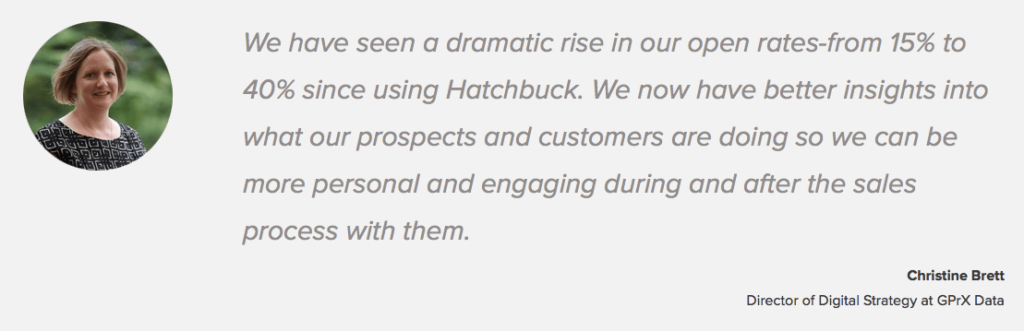
The most important thing is to use social proof that is real – Pictures of actual customers, with real profiles and real quotes. After all, the whole point is establishing your brand as reliable and trustworthy. Email marketing software Hatchbuck makes great use of testimonials on its landing page. Notice how the testimonial includes a full name, photo, title, and an informative quote.
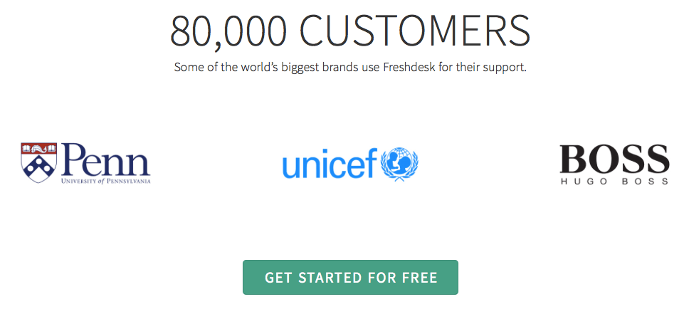
Another method that has proven to be effective, for B2B companies, in particular, is to include the logos of clients below the main theme. This is a great boost to credibility, especially if the clients are widely known brands. In the example below, Freshdesk showcases how many customers use their services and lists some big-name brands.
8. Not Taking A/B Tests Seriously
So you’ve researched all the best practices, and designed multiple landing pages, catering to the different segments of your audience. They load at the speed of light, have a beautiful clean design, and concise, effective copy. These landing pages are going to do well, you can just feel it.
No matter how deeply you trust your gut instincts, ultimately your decisions should be based on data. It’s always better to create multiple versions of each landing page to find out which elements of it actually work. Examples of things to test:
- Headline – as soon as the page loads, visitors need to understand what they’re being offered, and why it’s worth their while. Would a straight-forward headline outperform a more creative one? Only one way to check.
- Text length
- Image background vs. one color background
- CTA placing
- CTA wording – A more detailed CTA that uses first and second person pronouns is likely to work better than a generic one. For example, ‘Get My Free Audit’ instead of simply ‘Download’. Play around with different variations to see what copy performs best.
- Image placement – The same image could work great in one spot and be a distraction when placed elsewhere. A/B testing is a surefire way to optimize your image placement.
- Image/ video – which is more effective?
Landing page builders like Unbounce or Wishpond allow you to easily split traffic between variants and track which pages performed better. Remember to test one element at a time, so you know what exactly caused the results to improve.
To sum up
You could get a bunch of traffic to your landing page, but it will amount to nothing if it doesn’t actually end up generating leads. There are a few mistakes you must avoid when building a landing page.
Slow loading pages are sure to hold back your conversion, as are cluttered designs which distract the user from the page’s primary goal.
Avoid bringing all your traffic to one generic landing page. Instead, create multiple variations to cater to different customer personas. Also, consider how the lead landed on your page in the first place, and change the CTA accordingly (don’t scare off cold customers, warm them up gradually).
Don’t underestimate the importance of a mobile-friendly design and don’t be afraid of a multi-step lead gen form to make the process less intimidating and bring up micro-conversion rates.
But hey, even if you catch any of these slip-ups on your landing page, don’t sweat it too much. Look at it as a chance to turn things around and grow.
Once we implemented some of those changes to the landing page of long-time Target Audience client Userway, we saw the conversion rate from visit to purchase climb up by 23%!
What did we do? Refined the headline so the benefits of the paid version are clearer, optimized the mobile version so the form is above the fold, and cleared the page of unnecessary copy which created clutter.