A product page is the most important page on your eCommerce site. Having a well-designed and user-friendly homepage is great, but chances are this will not be the first page most visitors will land on. In most cases, visitors will land directly on your product page after searching for a specific item, such as “seamless yoga pants” or “waterproof smartwatch”. That means it’s essential that optimize each and every one of your product pages and follow best practices.
Eventually, the quality of an eCommerce product page can make the difference between a bounce and a conversion, just like any landing page. A successful product page does the following:
- Immediately draw the consumer’s attention to the add to cart button.
- Provide all the necessary information a consumer needs about the product and brand (after all, we’re assuming that they bypassed your homepage).
- Build trust in your product and company through social proof.
- Upsell or resell to increase average order value AOV.
There are a variety of ways to reach these goals and optimize your product pages so they live up to their highest conversion potential. In the article below, we’ve listed all the must-have elements for a killer eCommerce product page. No matter what is your industry, these are the fundamental best practices that need to be on your product page if you want to move your visitors deeper into the buyer journey and increase sales.
11 eCommerce Product Page Best Practices
1. High-quality images
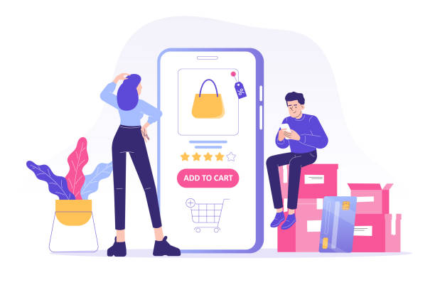
A feature image is hands down the single most important element of an eCommerce product page. It’s the first thing to catch a user’s eye and help them decide whether to look further.
Your best bet is a polished, perfectly centered product image with a white or light background and soft or no shadows.
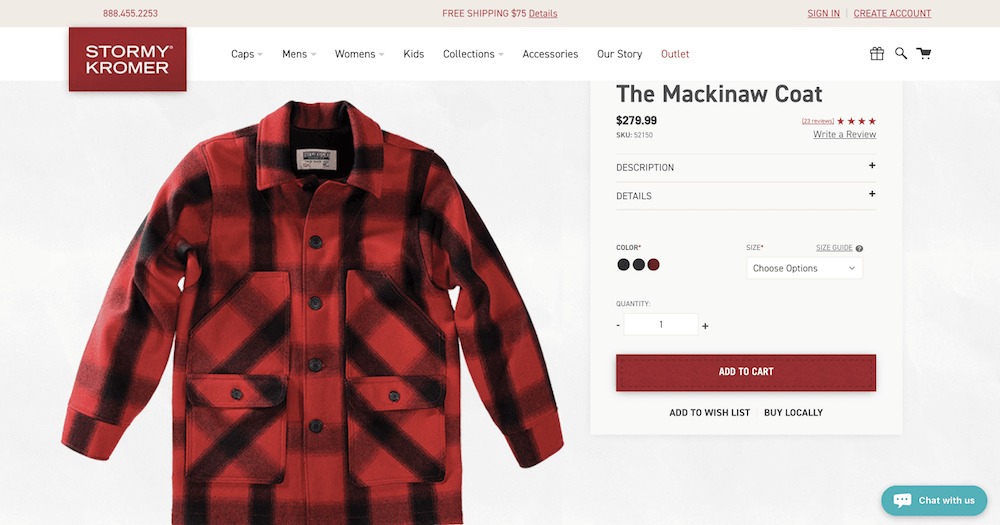
The featured image is the clearest representation of the item, but it certainly shouldn’t be the only one. Ideally, a product should have a gallery of about a dozen images, showing it from all different angles.
Most of them should be clean-cut, like the feature image, but it’s a good idea to add one or two in-context or lifestyle images to help shoppers visualize it better.
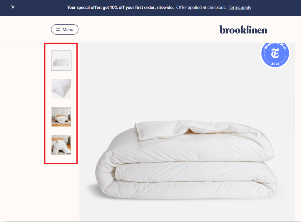
Here are a few extra things you can do to make the product ‘come alive’:
- Use a 360-degree shot.
- Use modal windows that enlarge thumbnails and allow users to zoom in on an image (this can give users a better understanding of a garment’s fabric texture, for example).
- Allow previous customers to upload photos they have taken of the product. This also functions as social proof – users are more prone to trust their neutral peers than the seller.
2. Product video
We could’ve recommended employing videos in the previous section, but then we realized videos are so important they deserve a paragraph of their own. Here’s why:
- Videos have a 41% higher click-through rate in search results.
- Shoppers are 64-85% more likely to purchase after watching a video.
Videos result in longer time spent on the page due to their length (keep them short though), which signals higher engagement to the algorithms. But more importantly, they make your product more accessible to shoppers. Besides paying for shipping, not being able to touch, feel, and try out a product is the most hated aspect of online shopping, according to BigCommerce. A video could certainly help customers understand the quality of the product better.
The bottom line is that having a product video on your product page can help you in every aspect of the online sales funnel.
3. Title and overview
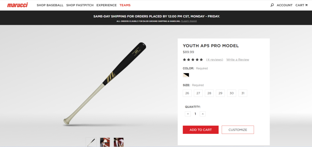
Moving on from your product page design to copy. Your product needs to give all the important information about the product right off the bat. This includes:
- Product name
- Price
- Features
- CTA
- Customization options
Ideally, all of this info should be visible above the fold. Remember, the overview is not the product description so it shouldn’t be text-heavy.
4. Unique product descriptions
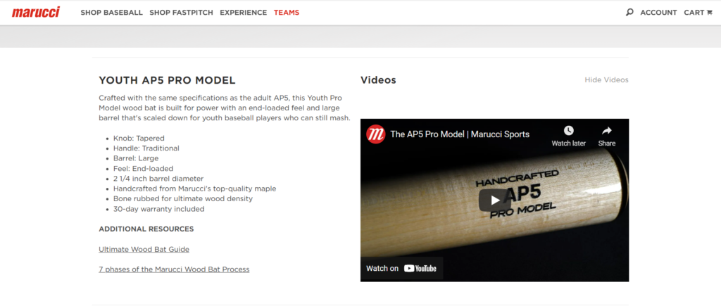
Many brands fail to make the most of product descriptions. Product descriptions are important because this is where you get in all of the product keywords and mention all the great things about the product, that will likely help you sell it. Is it sustainable? Is it organic? Is it waterproof or dryer-friendly?
Run a Google search for your desired keywords, and take a look at your competitors’ product pages. Your goal is to make yours better. Use bullet points and graphics to make the information easy to scan through.
5. Reviews and ratings
Customer ratings and reviews will help build brand trust and boost conversion. Over 80% of consumers consult reviews before making a purchase. Having a section of testimonials from previous buyers can help increase sales by as much as 18%.
Don’t wait for your customers to leave a review and hope for the best; actively ask them for feedback. Simply emailing your customers asking them to share their thoughts about their recent purchase will do a great deal to fill up your review section.
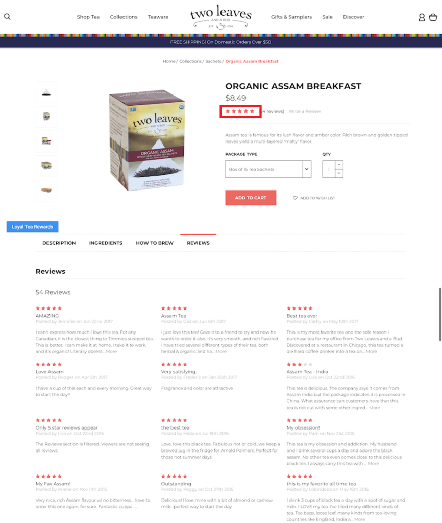
What should you ask? Keep it as minimal as possible to respect the reviewer’s time – a name, a short review, the rating, and the title of the review.
One last feature is to add an average rating snippet in the overview area (it usually goes below the headline).
6. Similar product suggestions
Let’s say the client took a look at your awesome product page but decided the product wasn’t the right fit for what they were looking for. Suggesting similar or complementing products at the bottom of the page is a strategy that helps you further engage and delight your visitors and boost the AOV without coming across as too ‘salesy’.
You have 3 options. You can use one or combine them:
- Customers also viewed: Customers who viewed this product also viewed these products…
- Related products: Products with similar names or descriptions.
- You may also like: This one is the same as ‘Related products’ only it appears as a pop-up instead of on the web page itself.

7. Easy navigation between pages
A typical eCommerce store can get relatively large, ranging from a few hundred to a few million pages. That’s why logical navigation menus are essential. Use breadcrumb navigation to let your users know where they are and how to access a different page if they want to. User experience is crucial both for ranking on Google and for, well, pleasing users and encouraging them to engage with your site longer.
Proper breadcrumb navigation will allow visitors to have a better understanding of the site’s hierarchy and to navigate easily to other areas of interest – which will increase time on site and reduce bounce rates. After all, no one is going to buy a product they can’t find. Better UX = higher chance of a conversion.
8. Customization options
Customization is an effective personalization tactic in eCommerce. If a certain item comes in a variety of sizes, colors, or versions, make it seamless for customers to customize their selected product. The best place to locate the customization options is usually the sidebar, but you can play around with the layout as long as they’re clearly visible and easy to find on the page.
Here’s an example from a shoe brand called Allbirds:
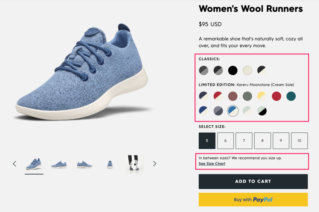
Their customization section is above the fold and rich in options. The more options you give your customers, the higher the chance that they can find an exact match to what they’re looking for.
9. FAQs and Chatbots
Make sure to provide a visible link to an FAQ section with the most common customer queries you’ve received. This page can be separated from the rest of your product page. Doing so will streamline your customer service process, enhance user experience, and boost the SEO value and performance of your product pages.
You can even go a step further and install a chatbot to answer common questions. What you certainly want to avoid is customers leaving your page to search for more info on Google.
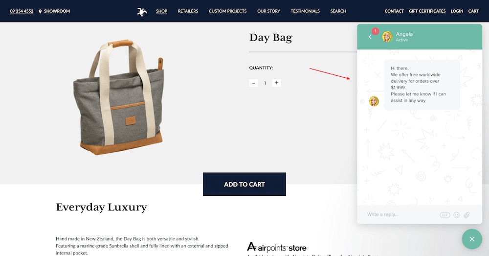
10. Clear shipping and return policies
Remember how we mentioned that paying for shipping is one of the most hated aspects of online shopping? The best way to instill trust in your customers is by stating your shipping and refund policies upfront.
Let your customers make an informed decision, and they won’t have an unpleasant surprise at checkout. If your shipping and refund policy is further along in your checkout process, you risk cart abandonment.
Vital information to include:
- Shipping methods.
- Shipping costs.
- Payment information.
- International shipping.
As for return policy, make sure you have all the bases covered as well:
- The non-returnable, non-exchangeable products.
- The time span during which customers can return or exchange an item (for example, 30 days past the purchase date).
- The policy regarding the condition of the returned item (for example, with the tags still intact).
- What steps do customers need to take in order to return or exchange?
11. A sense of urgency
This one isn’t absolutely fundamental like the rest of the list, but it can be very helpful for conversions. Creating a sense of urgency is one of the oldest tricks in the book, but it works. It prompts shoppers to shorten their decision-making process by tapping into the psychological phenomenon called Fear of Missing Out, or FOMO.
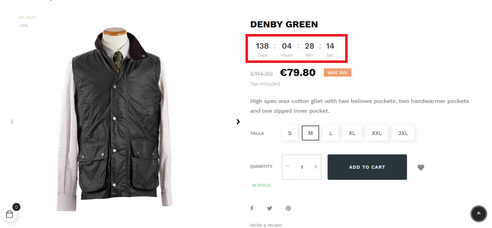
There are many ways to create a sense of urgency and trigger FOMO on your eCommerce product page:
- Show stock levels – a subtle way to let visitors know that the product is selling fast and there’s no time for pondering.
- A countdown clock – It could be for a 50% offer, last hours for free shopping, or the last 5 items in stock. Get creative with it.
- Show the number of other customers who already bought this product.
Final Thoughts
A product page is likely the first encounter a potential customer will have with your online store. Just like a landing page, an eCommerce product page can make the difference between a conversion and a bounce. In this article we covered the fundamental elements a product page needs to have:
- High-quality feature image.
- A gallery of images, showing the product from different angles.
- Product video.
- A concise description containing all your keywords.
- Customer reviews and ratings.
- Breadcrumbs and easy navigation between pages.
- Similar product suggestions.
- Customization options.
- FAQs or a chatbot.
- Clear shipping and return policies.
- Optional: a countdown clock or stock levels to create a sense of FOMO.


