Imagine you’re browsing on your phone and you land on a page that clearly isn’t optimized for mobile. The text is too small, the sentences are too long, and when you finally find the link you should click on, you hit the button right next to it instead. What would you do in such a case? Bounce, obviously.
It’s not exactly news that most online searches take place on a mobile device. In fact, studies show that up to 68.1% of global website visits come from mobile platforms. That means that if your website and landing pages don’t cater to mobile users, you’re missing out on lots of opportunities.
Since every conversion is important, having mobile-friendly landing pages is a non-negotiable for any business. But there is more to designing a mobile landing page than to make sure it’s responsive. People’s needs and behaviors are slightly different on their phones than on their laptops. Let’s take a look at a mobile user’s needs and 7 ways to improve your landing page visitors’ mobile experience.
Understanding the Mobile Audience’s Needs
Before you get to work and start creating mobile-friendly landing pages, there are two types of data you should research: your current mobile metrics and mobile audience data.
Firstly, take a look at your current mobile landing page metrics to understand why it doesn’t drive as much conversion as you’d like. Which elements of it could be improved?
Checking your mobile audience data is important because desktop and mobile users probably have different demographics, behaviors, and psychographics (an individual’s psychological characteristics, such as interests, values, opinions, and personality traits). Once you know who your mobile users are, you can line up your mobile landing page design with their characteristics and needs. Use your social media and website analytics to see what other platforms and brands they engage with.
7 Ways to Optimize Your Mobile Landing Page

1. Be mindful of how your design affects loading speed
When it comes to your landing page’s loading time, every second counts. And we mean it literally. A recent report from Google, Deloitte, and Fifty Five revealed how slight changes in mobile speed affected the site performance of 37 global brands. The study found that just a 0.1-second improvement could increase mobile conversions. Another study found that 53% of mobile website visitors leave a page if it takes longer than three seconds to load.
As you can tell, the loading speed should be your top priority. And yet, a lot of mobile landing pages miss the mark. The bright side is, slow loading is a fixable problem.
In most cases, resolving the issue and optimizing the loading speed would require the help of a developer. However, there are a few easy fixes you could try on your own first:
- Run your landing page through Google’s PageSpeed Insights to clock its average mobile loading speed and get some general advice for improving it.
- Reduce the content on the page.
- Optimize your images – According to Elementor, the ideal images for a fast-loading page weigh no more than 22KB-33KB.
2. Keep the design minimal
When you design a mobile landing page, be mindful of how long it gets. It goes without saying that mobile landing pages have less space to work with than their desktop counterparts. When you have a landing page that isn’t intentionally designed for mobile but rather reshapes responsively, it takes all of the elements in the desktop version and compresses them into a single-column mobile layout.
This usually results in an unnecessarily long mobile landing page. When you design a mobile landing page, always think about what you can do to make it as short as possible without compromising the content. Can you remove some of the images? Place the CTA above the fold?
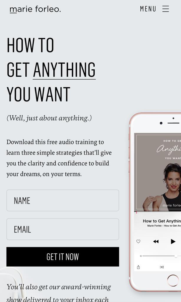
For example, take a look at how this Marie Forleo landing page: Beneath the CTA and download form, there is nothing but a footer and a few social proof logos.
3. Include sticky bars and buttons
It’s generally recommended to avoid distracting elements like headers and navigation on a landing page. But in some cases, a completely navigation-less landing page may leave mobile users feeling stuck.
If your landing page ends up being lengthy, it’s best to have a sticky “Click to Scroll” button, so users don’t have to scroll endlessly to get back to the top of the page or to the bottom of it. It’s also important to have a way to back and forth if you have a multi-step lead gen form.
The idea is to have minimal navigation that is not distracting, while still allowing the user to have a sense of control. Sticky bars and buttons are a great mobile-friendly solution for that.
4. Keep the copy short and sweet
Less screen real estate means less copy to work with. You want to make each word on your mobile landing page count. If that means that you have to slightly alter the copy of your desktop landing page, then that’s what you gotta do.
Have you ever heard of the term BLUF? Originally a military communications technique, BLUF stands for Bottom Line Up Front. It’s the practice of beginning a message with its most vital information. When writing copy for your mobile landing page, the BLUF method is your best friend.
Prioritize the most important information about your offer and make sure it’s the first thing to catch a user’s attention. Once you’ve written your copy, go into editing mode. Cut out any fluff that you can do without – shorten your sentences, choose expressive words over wordy phrases, and remove any redundant words.
A good example of a mobile landing page that uses all of these “less is more” principles is Promo:
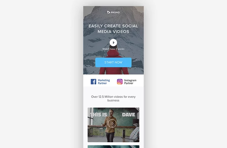
The headline “Easily Create Social Media Videos,” tells us what the value of the app is in just a few words. Then the subheading invites you to watch a video if you want to learn more.
5. Break up the copy with strong visuals
Even if you are very concise with your copy, sometimes you’re going to have to include more than just a heading and a subheading on your mobile landing page. That’s perfectly fine, just make sure users can quickly scan through it. The way to do it is by hierarchy and spacing.
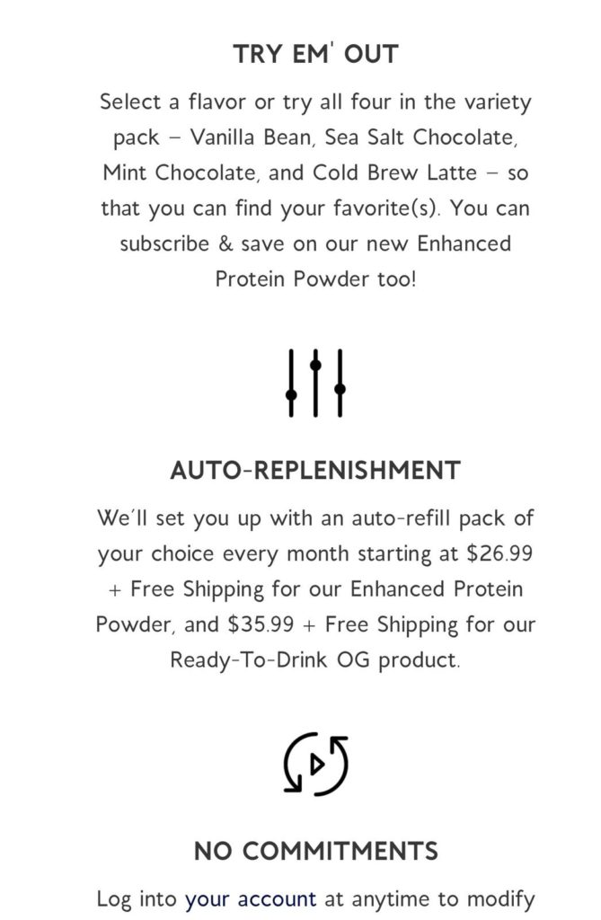
Apres, for example, is a company that makes plant-based protein drinks and powders. There is quite a lot of information on their landing page about how their subscription plan works. To make sure that readers can easily find the most important bits, they used big headers and short paragraphs to organize the content, as well as bold icons to separate each paragraph.
The general rule of thumb is you never want to user to have to scroll in order to finish reading a single paragraph.
6. Adjust the form to a mobile-friendly format
Typing on a phone takes more effort than using a keyboard. Especially if the user isn’t doing it from the comfort of their home, but while they’re walking down the street holding a bag of groceries in one hand.
Strip your sign-up form to the bare essentials, and give users the option to continue with Facebook/Google when possible.
This Taboola landing page is an excellent example of a well structured mobile form:
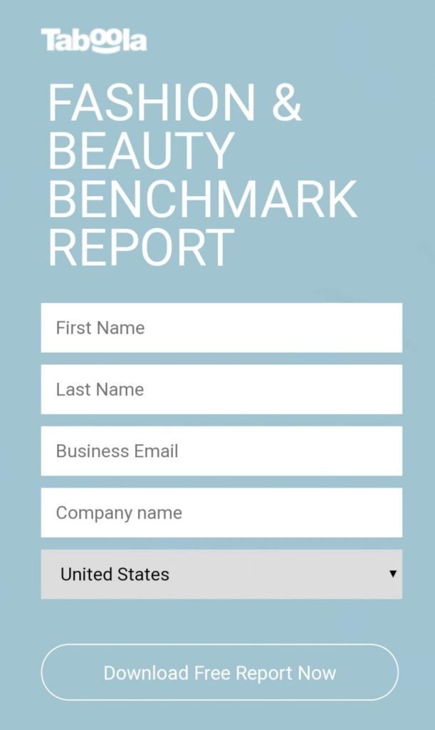
There is enough white space around the form field to make them clearly visible. The form fields and CTA buttons are both big enough, so tapping them with a finger or a thumb is easy. This lead gen form makes it as simple as possible for visitors to fill it out using a small screen.
7. Use sticky CTA buttons
Your landing page is there for one purpose: to convert. In desktop landing pages, the call to action is usually found at the bottom. In mobile, however, it’s best to keep the CTA button at the top of the page, above the fold, or better yet, use a sticky CTA button.
If a mobile user landed on your landing page, they were most likely redirected there from a targeted ad or marketing campaign. They are somewhat familiar with what they’re going to find there, so burying the CTA in the middle or bottom of a landing page would just cause friction.
The general rule of thumb is the CTA should always be within a scroll or two, no matter where the user is on the page. Instead of having your CTA appear multiple times, at the top, middle, and button of the screen, consider a sticky button. It provides a more elegant and convenient solution.
Final Thoughts
Creating a mobile-friendly landing page is essential if you don’t want to miss out on potential conversions. Despite the fact most online activity takes place on mobile, many people still remain hesitant about converting when using their smartphones. This means you need to pay extra attention to the design of your mobile landing page. That doesn’t just mean creating a responsive landing page. It means creating a seamless mobile experience.
The most important things to keep in mind:
- Optimize loading speed.
- Keep your copy concise and to the point using the BLUF method.
- Minimize the amount of text users have to scroll through.
- Break up chunks of copy with visual elements, to make the text easy to skim through.
- Add sticky elements for navigation so users don’t feel stuck, lost or overwhelmed.
- Strip the lead gen form to the bare minimum, and make sure it’s convenient to fill out.
- On a long landing page, use a sticky CTA button to make sure it’s always within reach of the user.